
Программное создание графика (диаграммы) в VBA Excel с помощью метода Charts.Add на основе данных из диапазона ячеек на рабочем листе. Примеры.
Метод Charts.Add
В настоящее время на сайте разработчиков описывается метод Charts.Add2, который, очевидно, заменил метод Charts.Add. Тесты показали, что Charts.Add продолжает работать в новых версиях VBA Excel, поэтому в примерах используется именно он.
Синтаксис
|
Charts.Add ([Before], [After], [Count]) |
|
Charts.Add2 ([Before], [After], [Count], [NewLayout]) |
Параметры
Параметры методов Charts.Add и Charts.Add2:
| Параметр | Описание |
|---|---|
| Before | Имя листа, перед которым добавляется новый лист с диаграммой. Необязательный параметр. |
| After | Имя листа, после которого добавляется новый лист с диаграммой. Необязательный параметр. |
| Count | Количество добавляемых листов с диаграммой. Значение по умолчанию – 1. Необязательный параметр. |
| NewLayout | Если NewLayout имеет значение True, диаграмма вставляется с использованием новых правил динамического форматирования (заголовок имеет значение «включено», а условные обозначения – только при наличии нескольких рядов). Необязательный параметр. |
Если параметры Before и After опущены, новый лист с диаграммой вставляется перед активным листом.
Примеры
Таблицы
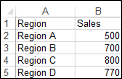
В качестве источников данных для примеров используются следующие таблицы:

Пример 1
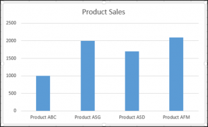
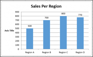
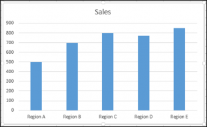
Программное создание объекта Chart с типом графика по умолчанию и по исходным данным из диапазона «A2:B26»:
|
Sub Primer1() Dim myChart As Chart ‘создаем объект Chart с расположением нового листа по умолчанию Set myChart = ThisWorkbook.Charts.Add With myChart ‘назначаем объекту Chart источник данных .SetSourceData (Sheets(«Лист1»).Range(«A2:B26»)) ‘переносим диаграмму на «Лист1» (отдельный лист диаграммы удаляется) .Location xlLocationAsObject, «Лист1» End With End Sub |
Результат работы кода VBA Excel из первого примера:

Пример 2
Программное создание объекта Chart с двумя линейными графиками по исходным данным из диапазона «A2:C26»:
|
Sub Primer2() Dim myChart As Chart Set myChart = ThisWorkbook.Charts.Add With myChart .SetSourceData (Sheets(«Лист1»).Range(«A2:C26»)) ‘задаем тип диаграммы (линейный график с маркерами) .ChartType = xlLineMarkers .Location xlLocationAsObject, «Лист1» End With End Sub |
Результат работы кода VBA Excel из второго примера:

Пример 3
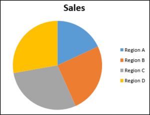
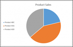
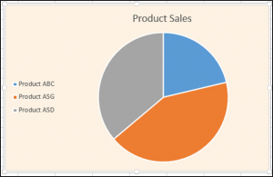
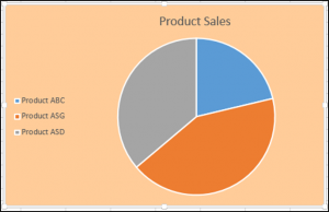
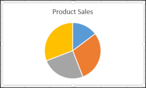
Программное создание объекта Chart с круговой диаграммой, разделенной на сектора, по исходным данным из диапазона «E2:F7»:
|
Sub Primer3() Dim myChart As Chart Set myChart = ThisWorkbook.Charts.Add With myChart .SetSourceData (Sheets(«Лист1»).Range(«E2:F7»)) ‘задаем тип диаграммы (пирог — круг, разделенный на сектора) .ChartType = xlPie ‘задаем стиль диаграммы (с отображением процентов) .ChartStyle = 261 .Location xlLocationAsObject, «Лист1» End With End Sub |
Результат работы кода VBA Excel из третьего примера:

Примечание
В примерах использовались следующие методы и свойства объекта Chart:
| Компонент | Описание |
|---|---|
| Метод SetSourceData | Задает диапазон исходных данных для диаграммы. |
| Метод Location | Перемещает диаграмму в заданное расположение (новый лист, существующий лист, элемент управления). |
| Свойство ChartType | Возвращает или задает тип диаграммы. Смотрите константы. |
| Свойство ChartStyle | Возвращает или задает стиль диаграммы. Значение нужного стиля можно узнать, записав макрос. |
Charts and graphs are one of the best features of Excel; they are very flexible and can be used to make some very advanced visualization. However, this flexibility means there are hundreds of different options. We can create exactly the visualization we want but it can be time-consuming to apply. When we want to apply those hundreds of settings to lots of charts, it can take hours and hours of frustrating clicking. This post is a guide to using VBA for Charts and Graphs in Excel.
The code examples below demonstrate some of the most common chart options with VBA. Hopefully you can put these to good use and automate your chart creation and modifications.
While it might be tempting to skip straight to the section you need, I recommend you read the first section in full. Understanding the Document Object Model (DOM) is essential to understand how VBA can be used with charts and graphs in Excel.
In Excel 2013, many changes were introduced to the charting engine and Document Object Model. For example, the AddChart2 method replaced the AddChart method. As a result, some of the code presented in this post may not work with versions before Excel 2013.
Adapting the code to your requirements
It is not feasible to provide code for every scenario you might come across; there are just too many. But, by applying the principles and methods in this post, you will be able to do almost anything you want with charts in Excel using VBA.
Understanding the Document Object Model
The Document Object Model (DOM) is a term that describes how things are structured in Excel. For example:
- A Workbook contains Sheets
- A Sheet contains Ranges
- A Range contains an Interior
- An Interior contains a color setting
Therefore, to change a cell color to red, we would reference this as follows:
ActiveWorkbook.Sheets("Sheet1").Range("A1").Interior.Color = RGB(255, 0, 0)Charts are also part of the DOM and follow similar hierarchical principles. To change the height of Chart 1, on Sheet1, we could use the following.
ActiveWorkbook.Sheets("Sheet1").ChartObjects("Chart 1").Height = 300Each item in the object hierarchy must be listed and separated by a period ( . ).
Knowing the document object model is the key to success with VBA charts. Therefore, we need to know the correct order inside the object model. While the following code may look acceptable, it will not work.
ActiveWorkbook.ChartObjects("Chart 1").Height = 300In the DOM, the ActiveWorkbook does not contain ChartObjects, so Excel cannot find Chart 1. The parent of a ChartObject is a Sheet, and the Parent of a Sheet is a Workbook. We must include the Sheet in the hierarchy for Excel to know what you want to do.
ActiveWorkbook.Sheets("Sheet1").ChartObjects("Chart 1").Height = 300With this knowledge, we can refer to any element of any chart using Excel’s DOM.
Chart Objects vs. Charts vs. Chart Sheets
One of the things which makes the DOM for charts complicated is that many things exist in many places. For example, a chart can be an embedded chart on the face of a worksheet, or as a separate chart sheet.
- On the worksheet itself, we find ChartObjects. Within each ChartObject is a Chart. Effectively a ChartObject is a container that holds a Chart.
- A Chart is also a stand-alone sheet that does not have a ChartObject around it.
This may seem confusing initially, but there are good reasons for this.
To change the chart title text, we would reference the two types of chart differently:
- Chart on a worksheet:
Sheets(“Sheet1”).ChartObjects(“Chart 1”).Chart.ChartTitle.Text = “My Chart Title” - Chart sheet:
Sheets(“Chart 1”).ChartTitle.Text = “My Chart Title”
The sections in bold are exactly the same. This shows that once we have got inside the Chart, the DOM is the same.
Writing code to work on either chart type
We want to write code that will work on any chart; we do this by creating a variable that holds the reference to a Chart.
Create a variable to refer to a Chart inside a ChartObject:
Dim cht As Chart
Set cht = Sheets("Sheet1").ChartObjects("Chart 1").Chart
Create a variable to refer to a Chart which is a sheet:
Dim cht As Chart
Set cht = Sheets("Chart 1")
Now we can write VBA code for a Chart sheet or a chart inside a ChartObject by referring to the Chart using cht:
cht.ChartTitle.Text = "My Chart Title"OK, so now we’ve established how to reference charts and briefly covered how the DOM works. It is time to look at lots of code examples.
Inserting charts
In this first section, we create charts. Please note that some of the individual lines of code are included below in their relevant sections.
Create a chart from a blank chart
Sub CreateChart()

'Declare variables
Dim rng As Range
Dim cht As Object

'Create a blank chart
  Set cht = ActiveSheet.Shapes.AddChart2

'Declare the data range for the chart
  Set rng = ActiveSheet.Range("A2:B9")

'Add the data to the chart
  cht.Chart.SetSourceData Source:=rng

'Set the chart type
  cht.Chart.ChartType = xlColumnClustered

End Sub
Reference charts on a worksheet
In this section, we look at the methods used to reference a chart contained on a worksheet.
Active Chart
Create a Chart variable to hold the ActiveChart:
Dim cht As Chart
Set cht = ActiveChart
Chart Object by name
Create a Chart variable to hold a specific chart by name.
Dim cht As Chart
Set cht = Sheets("Sheet1").ChartObjects("Chart 1").Chart
Chart object by number
If there are multiple charts on a worksheet, they can be referenced by their number:
- 1 = the first chart created
- 2 = the second chart created
- etc, etc.
Dim cht As Chart
Set cht = Sheets("Sheet1").ChartObjects(1).Chart
Loop through all Chart Objects
If there are multiple ChartObjects on a worksheet, we can loop through each:
Dim chtObj As ChartObject

For Each chtObj In Sheets("Sheet1").ChartObjects

    'Include the code to be applied to each ChartObjects
    'refer to the Chart using chtObj.cht.

Next chtObj
Loop through all selected Chart Objects
If we only want to loop through the selected ChartObjects we can use the following code.
This code is tricky to apply as Excel operates differently when one chart is selected, compared to multiple charts. Therefore, as a way to apply the Chart settings, without the need to repeat a lot of code, I recommend calling another macro and passing the Chart as an argument to that macro.
Dim obj As Object

'Check if any charts have been selected
If Not ActiveChart Is Nothing Then

    Call AnotherMacro(ActiveChart)

Else
    For Each obj In Selection

    'If more than one chart selected
    If TypeName(obj) = "ChartObject" Then

        Call AnotherMacro(obj.Chart)

    End If
Next

End If
Reference chart sheets
Now let’s move on to look at the methods used to reference a separate chart sheet.
Active Chart
Set up a Chart variable to hold the ActiveChart:
Dim cht As Chart
Set cht = ActiveChart
Note: this is the same code as when referencing the active chart on the worksheet.
Chart sheet by name
Set up a Chart variable to hold a specific chart sheet
Dim cht As Chart
Set cht = Sheets("Chart 1")
Loop through all chart sheets in a workbook
The following code will loop through all the chart sheets in the active workbook.
Dim cht As Chart

For Each cht In ActiveWorkbook.Charts

    Call AnotherMacro(cht)

Next cht
Basic chart settings
This section contains basic chart settings.
All codes start with cht., as they assume a chart has been referenced using the codes above.
Change chart type
'Change chart type - these are common examples, others do exist.
cht.ChartType = xlArea
cht.ChartType = xlLine
cht.ChartType = xlPie
cht.ChartType = xlColumnClustered
cht.ChartType = xlColumnStacked
cht.ChartType = xlColumnStacked100
cht.ChartType = xlArea
cht.ChartType = xlAreaStacked
cht.ChartType = xlBarClustered
cht.ChartType = xlBarStacked
cht.ChartType = xlBarStacked100
Create an empty ChartObject on a worksheet
'Create an empty chart embedded on a worksheet.
Set cht = Sheets("Sheet1").Shapes.AddChart2.Chart
Select the source for a chart
'Select source for a chart
Dim rng As Range
Set rng = Sheets("Sheet1").Range("A1:B4")
cht.SetSourceData Source:=rng
Delete a chart object or chart sheet
'Delete a ChartObject or Chart sheet
If TypeName(cht.Parent) = "ChartObject" Then

    cht.Parent.Delete

ElseIf TypeName(cht.Parent) = "Workbook" Then

    cht.Delete

End If
Change the size or position of a chart
'Set the size/position of a ChartObject - method 1
cht.Parent.Height = 200
cht.Parent.Width = 300
cht.Parent.Left = 20
cht.Parent.Top = 20

'Set the size/position of a ChartObject - method 2
chtObj.Height = 200
chtObj.Width = 300
chtObj.Left = 20
chtObj.Top = 20
Change the visible cells setting
'Change the setting to show only visible cells
cht.PlotVisibleOnly = False
Change the space between columns/bars (gap width)
'Change the gap space between bars
cht.ChartGroups(1).GapWidth = 50
Change the overlap of columns/bars
'Change the overlap setting of bars
cht.ChartGroups(1).Overlap = 75
Remove outside border from chart object
'Remove the outside border from a chart
cht.ChartArea.Format.Line.Visible = msoFalse
Change color of chart background
'Set the fill color of the chart area
cht.ChartArea.Format.Fill.ForeColor.RGB = RGB(255, 0, 0)

'Set chart with no background color
cht.ChartArea.Format.Fill.Visible = msoFalse
Chart Axis
Charts have four axis:
- xlValue
- xlValue, xlSecondary
- xlCategory
- xlCategory, xlSecondary
These are used interchangeably in the examples below. To adapt the code to your specific requirements, you need to change the chart axis which is referenced in the brackets.
All codes start with cht., as they assume a chart has been referenced using the codes earlier in this post.
Set min and max of chart axis
'Set chart axis min and max
cht.Axes(xlValue).MaximumScale = 25
cht.Axes(xlValue).MinimumScale = 10
cht.Axes(xlValue).MaximumScaleIsAuto = True
cht.Axes(xlValue).MinimumScaleIsAuto = True
Display or hide chart axis
'Display axis
cht.HasAxis(xlCategory) = True

'Hide axis
cht.HasAxis(xlValue, xlSecondary) = False
Display or hide chart title
'Display axis title
cht.Axes(xlCategory, xlSecondary).HasTitle = True

'Hide axis title
cht.Axes(xlValue).HasTitle = False
Change chart axis title text
'Change axis title text
cht.Axes(xlCategory).AxisTitle.Text = "My Axis Title"
Reverse the order of a category axis
'Reverse the order of a catetory axis
cht.Axes(xlCategory).ReversePlotOrder = True

'Set category axis to default order
cht.Axes(xlCategory).ReversePlotOrder = False
Gridlines
Gridlines help a user to see the relative position of an item compared to the axis.
Add or delete gridlines
'Add gridlines
cht.SetElement (msoElementPrimaryValueGridLinesMajor)
cht.SetElement (msoElementPrimaryCategoryGridLinesMajor)
cht.SetElement (msoElementPrimaryValueGridLinesMinorMajor)
cht.SetElement (msoElementPrimaryCategoryGridLinesMinorMajor)

'Delete gridlines
cht.Axes(xlValue).MajorGridlines.Delete
cht.Axes(xlValue).MinorGridlines.Delete
cht.Axes(xlCategory).MajorGridlines.Delete
cht.Axes(xlCategory).MinorGridlines.Delete
Change color of gridlines
'Change colour of gridlines
cht.Axes(xlValue).MajorGridlines.Format.Line.ForeColor.RGB = RGB(255, 0, 0)
Change transparency of gridlines
'Change transparency of gridlines
cht.Axes(xlValue).MajorGridlines.Format.Line.Transparency = 0.5
Chart Title
The chart title is the text at the top of the chart.
All codes start with cht., as they assume a chart has been referenced using the codes earlier in this post.
Display or hide chart title
'Display chart title
cht.HasTitle = True

'Hide chart title
cht.HasTitle = False
Change chart title text
'Change chart title text
cht.ChartTitle.Text = "My Chart Title"
Position the chart title
'Position the chart title
cht.ChartTitle.Left = 10
cht.ChartTitle.Top = 10
Format the chart title
'Format the chart title
cht.ChartTitle.TextFrame2.TextRange.Font.Name = "Calibri"
cht.ChartTitle.TextFrame2.TextRange.Font.Size = 16
cht.ChartTitle.TextFrame2.TextRange.Font.Bold = msoTrue
cht.ChartTitle.TextFrame2.TextRange.Font.Bold = msoFalse
cht.ChartTitle.TextFrame2.TextRange.Font.Italic = msoTrue
cht.ChartTitle.TextFrame2.TextRange.Font.Italic = msoFalse
Chart Legend
The chart legend provides a color key to identify each series in the chart.
Display or hide the chart legend
'Display the legend
cht.HasLegend = True

'Hide the legend
cht.HasLegend = False
Position the legend
'Position the legend
cht.Legend.Position = xlLegendPositionTop
cht.Legend.Position = xlLegendPositionRight
cht.Legend.Position = xlLegendPositionLeft
cht.Legend.Position = xlLegendPositionCorner
cht.Legend.Position = xlLegendPositionBottom

'Allow legend to overlap the chart.
'False = allow overlap, True = due not overlap
cht.Legend.IncludeInLayout = False
cht.Legend.IncludeInLayout = True

'Move legend to a specific point
cht.Legend.Left = 20
cht.Legend.Top = 200
cht.Legend.Width = 100
cht.Legend.Height = 25
Plot Area
The Plot Area is the main body of the chart which contains the lines, bars, areas, bubbles, etc.
All codes start with cht., as they assume a chart has been referenced using the codes earlier in this post.
Background color of Plot Area
'Set background color of the plot area
cht.PlotArea.Format.Fill.ForeColor.RGB = RGB(255, 0, 0)


'Set plot area to no background color
cht.PlotArea.Format.Fill.Visible = msoFalse
Set position of Plot Area
'Set the size and position of the PlotArea. Top and Left are relative to the Chart Area.
cht.PlotArea.Left = 20
cht.PlotArea.Top = 20
cht.PlotArea.Width = 200
cht.PlotArea.Height = 150
Chart series
Chart series are the individual lines, bars, areas for each category.
All codes starting with srs. assume a chart’s series has been assigned to a variable.
Add a new chart series
'Add a new chart series
Set srs = cht.SeriesCollection.NewSeries
srs.Values = "=Sheet1!$C$2:$C$6"
srs.Name = "=""New Series"""

'Set the values for the X axis when using XY Scatter
srs.XValues = "=Sheet1!$D$2:$D$6"
Reference a chart series
Set up a Series variable to hold a chart series:
- 1 = First chart series
- 2 = Second chart series
- etc, etc.
Dim srs As Series
Set srs = cht.SeriesCollection(1)
Referencing a chart series by name
Dim srs As Series
Set srs = cht.SeriesCollection("Series Name")
Delete a chart series
'Delete chart series
srs.Delete
Loop through each chart series
Dim srs As Series
For Each srs In cht.SeriesCollection

    'Do something to each series
    'See the codes below starting with "srs."

Next srs
Change series data
'Change series source data and name
srs.Values = "=Sheet1!$C$2:$C$6"
srs.Name = "=""Change Series Name"""
Changing fill or line colors
'Change fill colour
srs.Format.Fill.ForeColor.RGB = RGB(255, 0, 0)

'Change line colour
srs.Format.Line.ForeColor.RGB = RGB(255, 0, 0)
Changing visibility
'Change visibility of line
srs.Format.Line.Visible = msoTrue
Changing line weight
'Change line weight
srs.Format.Line.Weight = 10
Changing line style
'Change line style
srs.Format.Line.DashStyle = msoLineDash
srs.Format.Line.DashStyle = msoLineSolid
srs.Format.Line.DashStyle = msoLineSysDot
srs.Format.Line.DashStyle = msoLineSysDash
srs.Format.Line.DashStyle = msoLineDashDot
srs.Format.Line.DashStyle = msoLineLongDash
srs.Format.Line.DashStyle = msoLineLongDashDot
srs.Format.Line.DashStyle = msoLineLongDashDotDot
Formatting markers
'Changer marker type
srs.MarkerStyle = xlMarkerStyleAutomatic
srs.MarkerStyle = xlMarkerStyleCircle
srs.MarkerStyle = xlMarkerStyleDash
srs.MarkerStyle = xlMarkerStyleDiamond
srs.MarkerStyle = xlMarkerStyleDot
srs.MarkerStyle = xlMarkerStyleNone

'Change marker border color
srs.MarkerForegroundColor = RGB(255, 0, 0)

'Change marker fill color
srs.MarkerBackgroundColor = RGB(255, 0, 0)

'Change marker size
srs.MarkerSize = 8
Data labels
Data labels display additional information (such as the value, or series name) to a data point in a chart series.
All codes starting with srs. assume a chart’s series has been assigned to a variable.
Display or hide data labels
'Display data labels on all points in the series
srs.HasDataLabels = True

'Hide data labels on all points in the series
srs.HasDataLabels = False
Change the position of data labels
'Position data labels
'The label position must be a valid option for the chart type.
srs.DataLabels.Position = xlLabelPositionAbove
srs.DataLabels.Position = xlLabelPositionBelow
srs.DataLabels.Position = xlLabelPositionLeft
srs.DataLabels.Position = xlLabelPositionRight
srs.DataLabels.Position = xlLabelPositionCenter
srs.DataLabels.Position = xlLabelPositionInsideEnd
srs.DataLabels.Position = xlLabelPositionInsideBase
srs.DataLabels.Position = xlLabelPositionOutsideEnd
Error Bars
Error bars were originally intended to show variation (e.g. min/max values) in a value. However, they also commonly used in advanced chart techniques to create additional visual elements.
All codes starting with srs. assume a chart’s series has been assigned to a variable.
Turn error bars on/off
'Turn error bars on/off
srs.HasErrorBars = True
srs.HasErrorBars = False
Error bar end cap style
'Change end style of error bar
srs.ErrorBars.EndStyle = xlNoCap
srs.ErrorBars.EndStyle = xlCap
Error bar color
'Change color of error bars
srs.ErrorBars.Format.Line.ForeColor.RGB = RGB(255, 0, 0)
Error bar thickness
'Change thickness of error bars
srs.ErrorBars.Format.Line.Weight = 5
Error bar direction settings
'Error bar settings
srs.ErrorBar Direction:=xlY, _
    Include:=xlPlusValues, _
    Type:=xlFixedValue, _
    Amount:=100
'Alternatives options for the error bar settings are
'Direction:=xlX
'Include:=xlMinusValues
'Include:=xlPlusValues
'Include:=xlBoth
'Type:=xlFixedValue
'Type:=xlPercent
'Type:=xlStDev
'Type:=xlStError
'Type:=xlCustom

'Applying custom values to error bars
srs.ErrorBar Direction:=xlY, _
    Include:=xlPlusValues, _
    Type:=xlCustom, _
    Amount:="=Sheet1!$A$2:$A$7", _
    MinusValues:="=Sheet1!$A$2:$A$7"
Data points
Each data point on a chart series is known as a Point.
Reference a specific point
The following code will reference the first Point.
1 = First chart series
2 = Second chart series
etc, etc.
Dim srs As Series
Dim pnt As Point

Set srs = cht.SeriesCollection(1)
Set pnt = srs.Points(1)
Loop through all points
Dim srs As Series
Dim pnt As Point

Set srs = cht.SeriesCollection(1)

For Each pnt In srs.Points

    'Do something to each point, using "pnt."

Next pnt
Point example VBA codes
Points have similar properties to Series, but the properties are applied to a single data point in the series rather than the whole series. See a few examples below, just to give you the idea.
Turn on data label for a point
'Turn on data label
pnt.HasDataLabel = True
Set the data label position for a point
'Set the position of a data label
pnt.DataLabel.Position = xlLabelPositionCenter
Other useful chart macros
In this section, I’ve included other useful chart macros which are not covered by the example codes above.
Make chart cover cell range
The following code changes the location and size of the active chart to fit directly over the range G4:N20
Sub FitChartToRange()

'Declare variables
Dim cht As Chart
Dim rng As Range

'Assign objects to variables
Set cht = ActiveChart
Set rng = ActiveSheet.Range("G4:N20")

'Move and resize chart
cht.Parent.Left = rng.Left
cht.Parent.Top = rng.Top
cht.Parent.Width = rng.Width
cht.Parent.Height = rng.Height

End Sub
Export the chart as an image
The following code saves the active chart to an image in the predefined location
Sub ExportSingleChartAsImage()

'Create a variable to hold the path and name of image
Dim imagePath As String
Dim cht As Chart

imagePath = "C:UsersmarksDocumentsmyImage.png"
Set cht = ActiveChart

'Export the chart
cht.Export (imagePath)

End Sub
Resize all charts to the same size as the active chart
The following code resizes all charts on the Active Sheet to be the same size as the active chart.
Sub ResizeAllCharts()

'Create variables to hold chart dimensions
Dim chtHeight As Long
Dim chtWidth As Long

'Create variable to loop through chart objects
Dim chtObj As ChartObject

'Get the size of the first selected chart
chtHeight = ActiveChart.Parent.Height
chtWidth = ActiveChart.Parent.Width

For Each chtObj In ActiveSheet.ChartObjects

    chtObj.Height = chtHeight
    chtObj.Width = chtWidth

Next chtObj

End Sub
Bringing it all together
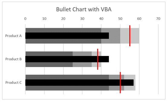
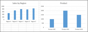
Just to prove how we can use these code snippets, I have created a macro to build bullet charts.
This isn’t necessarily the most efficient way to write the code, but it is to demonstrate that by understanding the code above we can create a lot of charts.
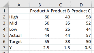
The data looks like this:
The chart looks like this:
The code which achieves this is as follows:
Sub CreateBulletChart()

Dim cht As Chart
Dim srs As Series
Dim rng As Range

'Create an empty chart
Set cht = Sheets("Sheet3").Shapes.AddChart2.Chart

'Change chart title text
cht.ChartTitle.Text = "Bullet Chart with VBA"

'Hide the legend
cht.HasLegend = False

'Change chart type
cht.ChartType = xlBarClustered

'Select source for a chart
Set rng = Sheets("Sheet3").Range("A1:D4")
cht.SetSourceData Source:=rng

'Reverse the order of a catetory axis
cht.Axes(xlCategory).ReversePlotOrder = True

'Change the overlap setting of bars
cht.ChartGroups(1).Overlap = 100

'Change the gap space between bars
cht.ChartGroups(1).GapWidth = 50

'Change fill colour
Set srs = cht.SeriesCollection(1)
srs.Format.Fill.ForeColor.RGB = RGB(200, 200, 200)

Set srs = cht.SeriesCollection(2)
srs.Format.Fill.ForeColor.RGB = RGB(150, 150, 150)

Set srs = cht.SeriesCollection(3)
srs.Format.Fill.ForeColor.RGB = RGB(100, 100, 100)

'Add a new chart series
Set srs = cht.SeriesCollection.NewSeries
srs.Values = "=Sheet3!$B$7:$D$7"
srs.XValues = "=Sheet3!$B$5:$D$5"
srs.Name = "=""Actual"""

'Change chart type
srs.ChartType = xlXYScatter

'Turn error bars on/off
srs.HasErrorBars = True

'Change end style of error bar
srs.ErrorBars.EndStyle = xlNoCap

'Set the error bars
srs.ErrorBar Direction:=xlY, _
    Include:=xlNone, _
    Type:=xlErrorBarTypeCustom

srs.ErrorBar Direction:=xlX, _
    Include:=xlMinusValues, _
    Type:=xlPercent, _
    Amount:=100

'Change color of error bars
srs.ErrorBars.Format.Line.ForeColor.RGB = RGB(0, 0, 0)

'Change thickness of error bars
srs.ErrorBars.Format.Line.Weight = 14

'Change marker type
srs.MarkerStyle = xlMarkerStyleNone

'Add a new chart series
Set srs = cht.SeriesCollection.NewSeries
srs.Values = "=Sheet3!$B$7:$D$7"
srs.XValues = "=Sheet3!$B$6:$D$6"
srs.Name = "=""Target"""

'Change chart type
srs.ChartType = xlXYScatter

'Turn error bars on/off
srs.HasErrorBars = True

'Change end style of error bar
srs.ErrorBars.EndStyle = xlNoCap

srs.ErrorBar Direction:=xlX, _
    Include:=xlNone, _
    Type:=xlErrorBarTypeCustom

srs.ErrorBar Direction:=xlY, _
    Include:=xlBoth, _
    Type:=xlFixedValue, _
    Amount:=0.45

'Change color of error bars
srs.ErrorBars.Format.Line.ForeColor.RGB = RGB(255, 0, 0)

'Change thickness of error bars
srs.ErrorBars.Format.Line.Weight = 2

'Changer marker type
srs.MarkerStyle = xlMarkerStyleNone

'Set chart axis min and max
cht.Axes(xlValue, xlSecondary).MaximumScale = cht.SeriesCollection(1).Points.Count
cht.Axes(xlValue, xlSecondary).MinimumScale = 0

'Hide axis
cht.HasAxis(xlValue, xlSecondary) = False

End Sub
Using the Macro Recorder for VBA for charts and graphs
The Macro Recorder is one of the most useful tools for writing VBA for Excel charts. The DOM is so vast that it can be challenging to know how to refer to a specific object, property or method. Studying the code produced by the Macro Recorder will provide the parts of the DOM which you don’t know.
As a note, the Macro Recorder creates poorly constructed code; it selects each object before manipulating it (this is what you did with the mouse after all). But this is OK for us. Once we understand the DOM, we can take just the parts of the code we need and ensure we put them into the right part of the hierarchy.
Conclusion
As you’ve seen in this post, the Document Object Model for charts and graphs in Excel is vast (and we’ve only scratched the surface.
I hope that through all the examples in this post you have a better understanding of VBA for charts and graphs in Excel. With this knowledge, I’m sure you will be able to automate your chart creation and modification.
Have I missed any useful codes? If so, put them in the comments.
Looking for other detailed VBA guides? Check out these posts:
- VBA for Tables & List Objects
- VBA for PivotTables
- VBA to insert, move, delete and control pictures

About the author
Hey, I’m Mark, and I run Excel Off The Grid.
My parents tell me that at the age of 7 I declared I was going to become a qualified accountant. I was either psychic or had no imagination, as that is exactly what happened. However, it wasn’t until I was 35 that my journey really began.
In 2015, I started a new job, for which I was regularly working after 10pm. As a result, I rarely saw my children during the week. So, I started searching for the secrets to automating Excel. I discovered that by building a small number of simple tools, I could combine them together in different ways to automate nearly all my regular tasks. This meant I could work less hours (and I got pay raises!). Today, I teach these techniques to other professionals in our training program so they too can spend less time at work (and more time with their children and doing the things they love).
Do you need help adapting this post to your needs?
I’m guessing the examples in this post don’t exactly match your situation. We all use Excel differently, so it’s impossible to write a post that will meet everybody’s needs. By taking the time to understand the techniques and principles in this post (and elsewhere on this site), you should be able to adapt it to your needs.
But, if you’re still struggling you should:
- Read other blogs, or watch YouTube videos on the same topic. You will benefit much more by discovering your own solutions.
- Ask the ‘Excel Ninja’ in your office. It’s amazing what things other people know.
- Ask a question in a forum like Mr Excel, or the Microsoft Answers Community. Remember, the people on these forums are generally giving their time for free. So take care to craft your question, make sure it’s clear and concise. List all the things you’ve tried, and provide screenshots, code segments and example workbooks.
- Use Excel Rescue, who are my consultancy partner. They help by providing solutions to smaller Excel problems.
What next?
Don’t go yet, there is plenty more to learn on Excel Off The Grid. Check out the latest posts:
In this Article
- Creating an Embedded Chart Using VBA
- Specifying a Chart Type Using VBA
- Adding a Chart Title Using VBA
- Changing the Chart Background Color Using VBA
- Changing the Chart Plot Area Color Using VBA
- Adding a Legend Using VBA
- Adding Data Labels Using VBA
- Adding an X-axis and Title in VBA
- Adding a Y-axis and Title in VBA
- Changing the Number Format of An Axis
- Changing the Formatting of the Font in a Chart
- Deleting a Chart Using VBA
- Referring to the ChartObjects Collection
- Inserting a Chart on Its Own Chart Sheet
Excel charts and graphs are used to visually display data. In this tutorial, we are going to cover how to use VBA to create and manipulate charts and chart elements.
You can create embedded charts in a worksheet or charts on their own chart sheets.
Creating an Embedded Chart Using VBA
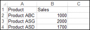
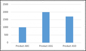
We have the range A1:B4 which contains the source data, shown below:
You can create a chart using the ChartObjects.Add method. The following code will create an embedded chart on the worksheet:
Sub CreateEmbeddedChartUsingChartObject()
Dim embeddedchart As ChartObject
Set embeddedchart = Sheets("Sheet1").ChartObjects.Add(Left:=180, Width:=300, Top:=7, Height:=200)
embeddedchart.Chart.SetSourceData Source:=Sheets("Sheet1").Range("A1:B4")
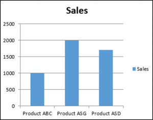
End SubThe result is:
You can also create a chart using the Shapes.AddChart method. The following code will create an embedded chart on the worksheet:
Sub CreateEmbeddedChartUsingShapesAddChart()

Dim embeddedchart As Shape

Set embeddedchart = Sheets("Sheet1").Shapes.AddChart
embeddedchart.Chart.SetSourceData Source:=Sheets("Sheet1").Range("A1:B4")

End Sub
Specifying a Chart Type Using VBA
We have the range A1:B5 which contains the source data, shown below:
You can specify a chart type using the ChartType Property. The following code will create a pie chart on the worksheet since the ChartType Property has been set to xlPie:
Sub SpecifyAChartType()

Dim chrt As ChartObject

Set chrt = Sheets("Sheet1").ChartObjects.Add(Left:=180, Width:=270, Top:=7, Height:=210)
chrt.Chart.SetSourceData Source:=Sheets("Sheet1").Range("A1:B5")
chrt.Chart.ChartType = xlPie

End Sub
The result is:
These are some of the popular chart types that are usually specified, although there are others:
- xlArea
- xlPie
- xlLine
- xlRadar
- xlXYScatter
- xlSurface
- xlBubble
- xlBarClustered
- xlColumnClustered
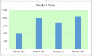
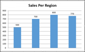
Adding a Chart Title Using VBA
We have a chart selected in the worksheet as shown below:
You have to add a chart title first using the Chart.SetElement method and then specify the text of the chart title by setting the ChartTitle.Text property.
The following code shows you how to add a chart title and specify the text of the title of the Active Chart:
Sub AddingAndSettingAChartTitle()

ActiveChart.SetElement (msoElementChartTitleAboveChart)
    ActiveChart.ChartTitle.Text = "The Sales of the Product"

End Sub
The result is:
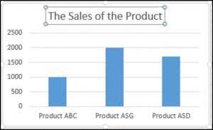
Note: You must select the chart first to make it the Active Chart to be able to use the ActiveChart object in your code.
Changing the Chart Background Color Using VBA
We have a chart selected in the worksheet as shown below:
You can change the background color of the entire chart by setting the RGB property of the FillFormat object of the ChartArea object. The following code will give the chart a light orange background color:
Sub AddingABackgroundColorToTheChartArea()

ActiveChart.ChartArea.Format.Fill.ForeColor.RGB = RGB(253, 242, 227)

End Sub
The result is:
You can also change the background color of the entire chart by setting the ColorIndex property of the Interior object of the ChartArea object. The following code will give the chart an orange background color:
Sub AddingABackgroundColorToTheChartArea()

ActiveChart.ChartArea.Interior.ColorIndex = 40

End Sub
The result is:
Note: The ColorIndex property allows you to specify a color based on a value from 1 to 56, drawn from the preset palette, to see which values represent the different colors, click here.
Changing the Chart Plot Area Color Using VBA
We have a chart selected in the worksheet as shown below:
You can change the background color of just the plot area of the chart, by setting the RGB property of the FillFormat object of the PlotArea object. The following code will give the plot area of the chart a light green background color:
Sub AddingABackgroundColorToThePlotArea()

ActiveChart.PlotArea.Format.Fill.ForeColor.RGB = RGB(208, 254, 202)

End Sub
The result is:
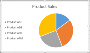
Adding a Legend Using VBA
We have a chart selected in the worksheet, as shown below:
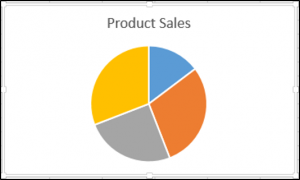
You can add a legend using the Chart.SetElement method. The following code adds a legend to the left of the chart:
Sub AddingALegend()

ActiveChart.SetElement (msoElementLegendLeft)

End Sub
The result is:
You can specify the position of the legend in the following ways:
- msoElementLegendLeft – displays the legend on the left side of the chart.
- msoElementLegendLeftOverlay – overlays the legend on the left side of the chart.
- msoElementLegendRight – displays the legend on the right side of the chart.
- msoElementLegendRightOverlay – overlays the legend on the right side of the chart.
- msoElementLegendBottom – displays the legend at the bottom of the chart.
- msoElementLegendTop – displays the legend at the top of the chart.
VBA Coding Made Easy
Stop searching for VBA code online. Learn more about AutoMacro — A VBA Code Builder that allows beginners to code procedures from scratch with minimal coding knowledge and with many time-saving features for all users!
Learn More
Adding Data Labels Using VBA
We have a chart selected in the worksheet, as shown below:
You can add data labels using the Chart.SetElement method. The following code adds data labels to the inside end of the chart:
Sub AddingADataLabels()

ActiveChart.SetElement msoElementDataLabelInsideEnd

End Sub
The result is:

You can specify how the data labels are positioned in the following ways:
- msoElementDataLabelShow – display data labels.
- msoElementDataLabelRight – displays data labels on the right of the chart.
- msoElementDataLabelLeft – displays data labels on the left of the chart.
- msoElementDataLabelTop – displays data labels at the top of the chart.
- msoElementDataLabelBestFit – determines the best fit.
- msoElementDataLabelBottom – displays data labels at the bottom of the chart.
- msoElementDataLabelCallout – displays data labels as a callout.
- msoElementDataLabelCenter – displays data labels on the center.
- msoElementDataLabelInsideBase – displays data labels on the inside base.
- msoElementDataLabelOutSideEnd – displays data labels on the outside end of the chart.
- msoElementDataLabelInsideEnd – displays data labels on the inside end of the chart.
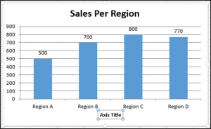
Adding an X-axis and Title in VBA
We have a chart selected in the worksheet, as shown below:
You can add an X-axis and X-axis title using the Chart.SetElement method. The following code adds an X-axis and X-axis title to the chart:
Sub AddingAnXAxisandXTitle()

With ActiveChart
.SetElement msoElementPrimaryCategoryAxisShow
.SetElement msoElementPrimaryCategoryAxisTitleHorizontal
End With


End Sub
The result is:
Adding a Y-axis and Title in VBA
We have a chart selected in the worksheet, as shown below:
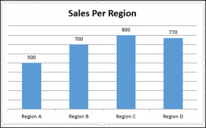
You can add a Y-axis and Y-axis title using the Chart.SetElement method. The following code adds an Y-axis and Y-axis title to the chart:
Sub AddingAYAxisandYTitle()

With ActiveChart
.SetElement msoElementPrimaryValueAxisShow
.SetElement msoElementPrimaryValueAxisTitleHorizontal
End With
End Sub
The result is:
VBA Programming | Code Generator does work for you!
Changing the Number Format of An Axis
We have a chart selected in the worksheet, as shown below:
You can change the number format of an axis. The following code changes the number format of the y-axis to currency:
Sub ChangingTheNumberFormat()

ActiveChart.Axes(xlValue).TickLabels.NumberFormat = "$#,##0.00"

End Sub
The result is:
Changing the Formatting of the Font in a Chart
We have the following chart selected in the worksheet as shown below:

You can change the formatting of the entire chart font, by referring to the font object and changing its name, font weight, and size. The following code changes the type, weight and size of the font of the entire chart.
Sub ChangingTheFontFormatting()

With ActiveChart


.ChartArea.Format.TextFrame2.TextRange.Font.Name = "Times New Roman"
.ChartArea.Format.TextFrame2.TextRange.Font.Bold = True
.ChartArea.Format.TextFrame2.TextRange.Font.Size = 14

End With
The result is:
Deleting a Chart Using VBA
We have a chart selected in the worksheet, as shown below:
We can use the following code in order to delete this chart:
Sub DeletingTheChart()

ActiveChart.Parent.Delete

End Sub
Referring to the ChartObjects Collection
You can access all the embedded charts in your worksheet or workbook by referring to the ChartObjects collection. We have two charts on the same sheet shown below:
We will refer to the ChartObjects collection in order to give both charts on the worksheet the same height, width, delete the gridlines, make the background color the same, give the charts the same plot area color and make the plot area line color the same color:
Sub ReferringToAllTheChartsOnASheet()

Dim cht As ChartObject

For Each cht In ActiveSheet.ChartObjects
cht.Height = 144.85
cht.Width = 246.61

cht.Chart.Axes(xlValue).MajorGridlines.Delete
cht.Chart.PlotArea.Format.Fill.ForeColor.RGB = RGB(242, 242, 242)
cht.Chart.ChartArea.Format.Fill.ForeColor.RGB = RGB(234, 234, 234)
cht.Chart.PlotArea.Format.Line.ForeColor.RGB = RGB(18, 97, 172)

Next cht

End Sub
The result is:
Inserting a Chart on Its Own Chart Sheet
We have the range A1:B6 which contains the source data, shown below:
You can create a chart using the Charts.Add method. The following code will create a chart on its own chart sheet:
Sub InsertingAChartOnItsOwnChartSheet()

Sheets("Sheet1").Range("A1:B6").Select
Charts.Add

End Sub
The result is:
See some of our other charting tutorials:
Charts in Excel
Create a Bar Chart in VBA
Charts, Charts, & More Charts!
Graphical visualizations are arguably the pinnacle of how an analyst shares his/her results and possessing the ability to manipulate them is key to the field. Since we as data analysts spend some much time creating graphs, it is more valuable than ever to understand how to automate them.
What if you have 20 graphs on a spreadsheet and they all need to have their legends in the exact same spot? What if you create a bunch of charts and your manager needs the series colors changed at the last minute? Do you want to do this all manually?
Below will be your cheat sheet for manipulating Excel charts & graphs with VBA code. Please let me know via the comments section if there are areas missing from this guide so I can expand on them. Enjoy!
VBA Chart Guide Contents
-
Create/Insert Chart
-
Looping Through Charts/Series
-
Chart Title (Adding/Modifying)
-
Chart Legend (Adding/Modifying)
-
Adding Various Chart Attributes
-
Modifying Various Chart Attributes
-
Removing Various Chart Attributes
-
Change Chart Colors
-
Chart Excel Add-ins
Inserting A Chart
Method 1:
Sub CreateChart()
‘PURPOSE: Create a chart (chart dimensions are not required)
Dim rng As Range
Dim cht As Object
‘Your data range for the chart
Set rng = ActiveSheet.Range(«A24:M27»)
‘Create a chart
Set cht = ActiveSheet.Shapes.AddChart2
‘Give chart some data
cht.Chart.SetSourceData Source:=rng
‘Determine the chart type
cht.Chart.ChartType = xlXYScatterLines
End Sub
Sub CreateChart()
‘PURPOSE: Create a chart (chart dimensions are required)
Dim rng As Range
Dim cht As ChartObject
‘Your data range for the chart
Set rng = ActiveSheet.Range(«A24:M27»)
‘Create a chart
Set cht = ActiveSheet.ChartObjects.Add( _
Left:=ActiveCell.Left, _
Width:=450, _
Top:=ActiveCell.Top, _
Height:=250)
‘Give chart some data
cht.Chart.SetSourceData Source:=rng
‘Determine the chart type
cht.Chart.ChartType = xlXYScatterLines
End Sub
Looping Through Charts & Series
Sub LoopThroughCharts()
‘PURPOSE: How to cycle through charts and chart series
Dim cht As ChartObject
Dim ser As Series
‘Loop Through all charts on ActiveSheet
For Each cht In ActiveSheet.ChartObjects
Next cht
‘Loop through all series in a chart
For Each ser In grph.Chart.SeriesCollection
Next ser
‘Loop Through all series on Activesheet
For Each cht In ActiveSheet.ChartObjects
For Each ser In grph.Chart.SeriesCollection
Next ser
Next cht
End Sub
Adding & Modifying A Chart Title
Add Chart Title
Sub AddChartTitle()
‘PURPOSE: Add a title to a specific chart
Dim cht As ChartObject
Set cht = ActiveSheet.ChartObjects(«Chart 1»)
‘Ensure chart has a title
cht.Chart.HasTitle = True
‘Change chart’s title
cht.Chart.ChartTitle.Text = «My Graph»
End Sub
Move/Reposition Chart Title
Sub RepositionChartTitle()
‘PURPOSE: Reposition a chart’s title
Dim cht As ChartObject
Set cht = ActiveSheet.ChartObjects(«Chart 1»)
‘Reposition title
With cht.Chart.ChartTitle
.Left = 100
.Top = 50
End With
End Sub
Adding & Modifying A Graph Legend
Insert/Create Chart Legend
Sub InsertChartLegend()
Dim cht As Chart
Set cht = ActiveSheet.ChartObjects(«Chart 1»).Chart
‘Add Legend to the Right
cht.SetElement (msoElementLegendRight)
‘Add Legend to the Left
cht.SetElement (msoElementLegendLeft)
‘Add Legend to the Bottom
cht.SetElement (msoElementLegendBottom)
‘Add Legend to the Top
cht.SetElement (msoElementLegendTop)
‘Add Overlaying Legend to the Left
cht.SetElement (msoElementLegendLeftOverlay)
‘Add Overlaying Legend to the Right
cht.SetElement (msoElementLegendRightOverlay)
End Sub
Resize/Move Chart Legend
Sub DimensionChartLegend()
Dim lgd As Legend
Set lgd = ActiveSheet.ChartObjects(«Chart 1»).Chart.Legend
lgd.Left = 240.23
lgd.Top = 6.962
lgd.Width = 103.769
lgd.Height = 25.165
End Sub
Adding Various Chart Attributes
Sub AddStuffToChart()
Dim cht As Chart
Set cht = ActiveSheet.ChartObjects(«Chart 1»).Chart
‘Add X-axis
cht.HasAxis(xlCategory, xlPrimary) = True ‘[Method #1]
cht.SetElement (msoElementPrimaryCategoryAxisShow) ‘[Method #2]
‘Add X-axis title
cht.Axes(xlCategory, xlPrimary).HasTitle = True ‘[Method #1]
cht.SetElement (msoElementPrimaryCategoryAxisTitleAdjacentToAxis) ‘[Method #2]
‘Add y-axis
cht.HasAxis(xlValue, xlPrimary) = True ‘[Method #1]
cht.SetElement (msoElementPrimaryValueAxisShow) ‘[Method #2]
‘Add y-axis title
cht.Axes(xlValue, xlPrimary).HasTitle = True ‘[Method #1]
cht.SetElement (msoElementPrimaryValueAxisTitleAdjacentToAxis) ‘[Method #2]
‘Add Data Labels (Centered)
cht.SetElement (msoElementDataLabelCenter)
‘Add Major Gridlines
cht.SetElement (msoElementPrimaryValueGridLinesMajor)
‘Add Linear Trend Line
cht.SeriesCollection(1).Trendlines.Add Type:=xlLinear
End Sub
Modifying Various Chart Attributes
Sub ChangeChartFormatting()
Dim cht As Chart
Set cht = ActiveSheet.ChartObjects(«Chart 1»).Chart
‘Adjust y-axis Scale
cht.Axes(xlValue).MinimumScale = 40
cht.Axes(xlValue).MaximumScale = 100
‘Adjust x-axis Scale
cht.Axes(xlCategory).MinimumScale = 1
cht.Axes(xlCategory).MaximumScale = 10
‘Adjust Bar Gap
cht.ChartGroups(1).GapWidth = 60
‘Format Font Size
cht.ChartArea.Format.TextFrame2.TextRange.Font.Size = 12
‘Format Font Type
cht.ChartArea.Format.TextFrame2.TextRange.Font.Name = «Arial»
‘Make Font Bold
cht.ChartArea.Format.TextFrame2.TextRange.Font.Bold = msoTrue
‘Make Font Italicized
cht.ChartArea.Format.TextFrame2.TextRange.Font.Italic = msoTrue
End Sub
Removing Various Chart Attributes
Sub RemoveChartFormatting()
Dim cht As Chart
Set cht = ActiveSheet.ChartObjects(«Chart 1»).Chart
‘Remove Chart Series
cht.SeriesCollection(2).Delete
‘Remove Gridlines
cht.Axes(xlValue).MajorGridlines.Delete
cht.Axes(xlValue).MinorGridlines.Delete
‘Remove X-axis
cht.Axes(xlCategory).Delete
‘Remove Y-axis
cht.Axes(xlValue).Delete
‘Remove Legend
cht.Legend.Delete
‘Remove Title
cht.ChartTitle.Delete
‘Remove ChartArea border
cht.ChartArea.Border.LineStyle = xlNone
‘No background color fill
cht.ChartArea.Format.Fill.Visible = msoFalse
cht.PlotArea.Format.Fill.Visible = msoFalse
End Sub
Change Chart Colors
Sub ChangeChartColors()
Dim cht As Chart
Set cht = ActiveSheet.ChartObjects(«Chart 1»).Chart
‘Change first bar chart series fill color
cht.SeriesCollection(1).Format.Fill.ForeColor.RGB = RGB(91, 155, 213)
‘Change X-axis label color
cht.Axes(xlCategory).TickLabels.Font.Color = RGB(91, 155, 213)
‘Change Y-axis label color
cht.Axes(xlValue).TickLabels.Font.Color = RGB(91, 155, 213)
‘Change Plot Area border color
cht.PlotArea.Format.Line.ForeColor.RGB = RGB(91, 155, 213)
‘Change Major gridline color
cht.Axes(xlValue).MajorGridlines.Format.Line.ForeColor.RGB = RGB(91, 155, 213)
‘Change Chart Title font color
cht.ChartTitle.Format.TextFrame2.TextRange.Font.Fill.ForeColor.RGB = RGB(91, 155, 213)
‘No background color fill
cht.ChartArea.Format.Fill.Visible = msoFalse
cht.PlotArea.Format.Fill.Visible = msoFalse
End Sub
Chart Excel Add-ins
-
Waterfall Chart Excel Add-in — Automatically create editable Waterfall Charts directly in your spreadsheet.
-
AutoChart Excel Add-in — This add-in will allow you to create, manipulate series ranges, and format all your charts at once. Making adjustments has never been easier!
-
myBrand Excel Add-in — Stores your favorite colors to the Excel Ribbon and allows you to color cells, shapes, and charts.
-
Peltier Tech Charts for Excel — A chart-building toolkit with the automated creation of difficult chart builds such as Histograms, Pareto, Marimekko, and many more.
Anything You Would Like To See?
There are a ton of things you can do with VBA and Excel charts. I attempted through this guide to tackle the most general ones, but please don’t hesitate to leave a comment if there is something that you would like to see added to the code in this VBA guide. Hopefully, you were able to find what you were looking for!

About The Author
Hey there! I’m Chris and I run TheSpreadsheetGuru website in my spare time. By day, I’m actually a finance professional who relies on Microsoft Excel quite heavily in the corporate world. I love taking the things I learn in the “real world” and sharing them with everyone here on this site so that you too can become a spreadsheet guru at your company.
Through my years in the corporate world, I’ve been able to pick up on opportunities to make working with Excel better and have built a variety of Excel add-ins, from inserting tickmark symbols to automating copy/pasting from Excel to PowerPoint. If you’d like to keep up to date with the latest Excel news and directly get emailed the most meaningful Excel tips I’ve learned over the years, you can sign up for my free newsletters. I hope I was able to provide you with some value today and I hope to see you back here soon!
— Chris
Founder, TheSpreadsheetGuru.com
Excel is an important software provided by Microsoft Corporation. This software belongs to one of the major software suites Office 365. In this software suite, there are other software are present like Word, PowerPoint, etc. They are called Office 365, as this software are mostly used for office purpose. But now the world has changed a lot. After the Corona Pandemic, the world knows the positivity of using digital tools. Office 365 was not different from that. As a part of the software suite, Excel software also gains some importance from the users. They are not only used for official purposes. But they can also be used for school purposes. Excel is software that can able to store data in an effective form. So, searching for the data becomes more manageable in this software.
Excel has another great feature. It can be used to derive the charts from the provided data. The charts are helpful for analyzing any growth of the data. If there are thousands of data present, it is a difficult task to extract some analysis from that data. But if those data are converted to charts, then it will be easy to analyze those data. Excel sheet helps to do the same. Charts can be prepared whatever the number of data is present in the Excel sheet. The process of preparation of the charts can be done in two ways. In one case, users need to do operations on their own. On the other hand, users need to write a certain function to generate those things.
Creation of Charts in Excel using Worksheet Data
In this method, there is a need to have worksheet data. This is a simple method to create charts from the given data. This is the manual method. This means, there is no involvement of any code or automation is included. All the operations need to be executed by the user. Though it is executed by the user, still it is a lot easier than other processes. As this process can be done by any individual without having any issues or any previous knowledge.
Step 1: Users first need to have a set of data from creating the charts. They need to write all of them on the Excel worksheet. This is the simple process, they need to do. After that, users need to select the area from which they need to extract the chart. In the worksheet data, there might be some data that need to be excluded from the chart. So, users need to select the data that must be in the chart.
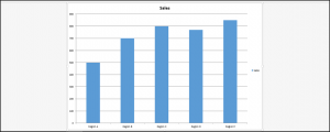
Step 2: Now, users need to press the Alt+F1 button simultaneously. As a result, promptly the data will be visible to the users in form of a chart. Now, users can drag the chart in any direction. Also, they can use it for some other software. This chart will help to analyze the data. This is a simple process.

Hence, we have successfully created a chart in Excel using worksheet data.
Creation of Charts in Excel using VBA Code
VBA code is a special type of programming language. But they are not considered conceptual programming langue like Python, Java, etc. This is the simple programming language that belongs to the software under Office 365. This means Word, Excel, etc. software can able to understand those. This is a programming language, that can be human-readable. Also, this helps to automate some tasks in the Excel file. This will also help to generate charts.
Step 1: Here also, users need to have some data to use the VBA code to generate the charts. Here for the demonstration purpose, a set of data is allocated.

Step 2: Users need to move to the Developer Tab. In this tab, users will find some more options. Among those options, one option will be Design Mode. Users need to click on that to open the VBA editor.
Note: If users are using some old version of Excel, then there might not be a tab called Developer. In those cases, users need to click Alt+F11 simultaneously. This will help to open the same VBA Window for editing purposes. So, there is no need to be worried for the users. Users might even use the Office 2007 Edition. But this process will work in every edition version.

Step 3: Now, users need to write a piece of code. This code might seem like an as difficult one. But analyzing this code step by step will help to understand the approach easily. Let us try to find the process step by step.
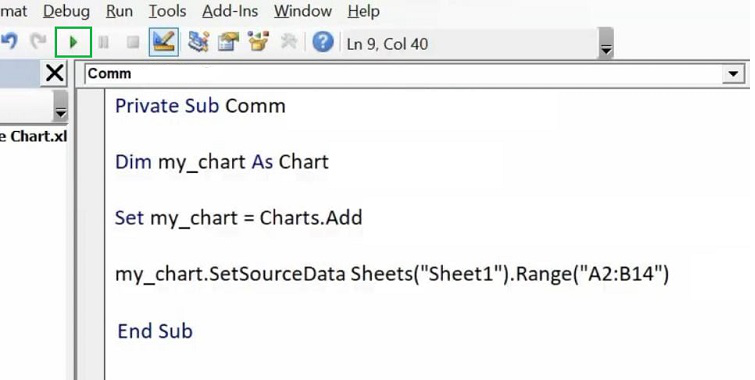
- Users first need to declare a subject. It is the same process that a programmer needs to do for writing programs in the C programming language. In C programming language, programmers used to write the main() function as the starting region. In this case, the “Sub” will act the same. Users need to declare access modifiers there as Java programming language. Also, users need to provide a name for it.
- Now, users need to declare a variable to do further operations. The declaration of the variable is done using the keyword “Dim” here. Now, users need to provide a variable name & join that variable for creating the chart.
- Now, users need to use the “Set” keyword to add the variable for the creation of the charts. This line helps to implement a chart using the variable that is declared.
- Now, users need to provide data to the variable. So, for providing the data, users need to use the “SetSourceData” keyword. Also, users need to provide the sheet name & range of the data by which the chart is going to be prepared. Users need to provide the “Sheet” name there. This is the simple sheet, not the worksheet.
- Now, the process is completed. It is time to end the process. Users need to use the “End” keyword there. This is the same process that any programmer needs to do in the C programming language using the ending brace.
VBA Code:
Private Sub Comm
Dim my_chart As Chart
Set my_chart = Charts.Add
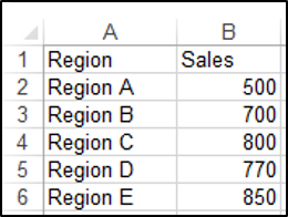
my_chart.SetSourceData Sheets(“Sheet1”).Range(“A2:B14”)
End Sub

Step 4: Now, after the process is completed, users will find a play button on the upper side of the VBA Editor. Users need to click on that button to generate the charts from the written code.
Step 5: Now, the chart is available there in front of the users. Users can use this chart for any other software. Also, users can drag to any other position.

Hence, we have successfully created a chart in Excel using VBA Code.
Conclusion
Excel is a powerful software for managing a large scale of data. It is used for analyzing data in a small amount of time. Excel software is used to convert a series of data into another format. That is the reason, this software is used to generate charts from the data provided there. In this article, we have demonstrated the process to generate charts using the worksheet data. Along with that, we have discussed the method to use VBA code & implement charts from a given data. The step-by-step implementation process of the VBA code is also discussed here.